
It's hard to believe how much small changes can sometimes affect the conversion rate of your website. We have seen conversion rate increases of over 100% from simple changes that would have taken less than 15 minutes. Below are some great examples of such changes that have had profound effects on conversion rates. Whilst we're not suggesting that the same changes will necessarily work for all websites, these cases certainly show the value of user testing. User testing is easy to set up and as you'll see, the results speak for themselves.
1. Personalising your design: 102% increase in signups
37signals do a lot of conversion rate testing of their website including playing around with ideas of personalisation. No one could have predicted the success of adding a big picture of a person, representing their target demographic. If a picture traditionally 'paints a thousand words', then within web design, it is probably closer to ten thousand! Your imagery should usually demonstrate what you do as a business, however in this instance 37signals buck 'best practice’ and simply put in an image of a girl who represents their target market. They do have very clear messaging and calls to action to support this, which is important, but the result was a huge 102% increase in signups.
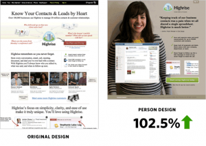
Source: http://37signals.com/svn/posts/2991-behind-the-scenes-ab-testing-part-3-final
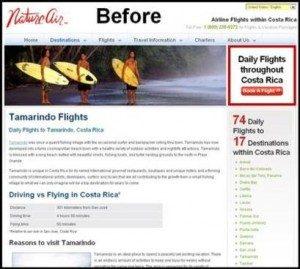
2. Obvious call to action button: 591% increase in conversions
It is vital to consider how you are leading someone through your website. What is the objective and how are you leading them there? CLEAR calls to action (CTAs) are incredibly important, and best practice suggests that you should only have one CTA above the fold of the page and then another supporting CTA throughout the page. In this example the second CTA is in a very intuitive spot towards the top right. In addition the price is displayed, so that people know what they are getting, and the title links back in to the title of the page to show relevancy. This is such a simple change but shows how important CTAs are!
Source: http://www.blastam.com/blog/index.php/2009/06/google-website-optimizer-increases-conversion-591/

3. Button colour change to Red: 21% increase in conversions
You can’t get much more simple than a colour change. In this instance a button colour change to red increased conversions by 21%. It is definitely not the case that red is always the best colour for conversions, but the point that trying some different options can be hugely beneficial. CTA buttons need to stand out visually, so be sure to use colour effectively.
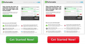
Source: http://blog.hubspot.com/blog/tabid/6307/bid/20566/The-Button-Color-A-B-Test-Red-Beats-Green.aspx
Like most, you are probably too close to your website and won’t know exactly what can be improve. If you're not sure where to start, some paid user tests at TestMate Australia will cost you around $100. You get three user tests and you will learn a HEAP about the performance of your website. Or you can just get some friends who are not as familiar with your website to go through it. Either way, just make sure you start testing, it could change your website and ultimately your business!