In 2020, with so much business moving online, it’s never been more important to design a website that talks directly to your customers in a way they want. It’s also vital your site leads to the highest conversion rates, hence maximising your capacity to generate revenue. To help you achieve this, I’d like to show you three magic bullets (or web design principles) I believe are fundamental ) to effective web design. (When you do these well, you’ll leave your competitors for dead.) They are actually really simple principles, yet so few companies properly follow them. You will see that if you just follow what is outlined in this article, you’ll create a bulletproof website head and shoulders above those of your competitors’.
Before we jump into these magic bullets, it’s worth providing some background. What we are exploring here are fundamental lessons we’ve learned through the thousands of user tests we’ve done on client websites-many of which you may have visited, such as Coles, Woolies, Services Australia, Medibank, Westpac, Mitsubishi and Red Balloon, to name a few. What is interesting is that the common determinants of success are consistently the same and if you nail the fundamentals, these website design principles, you are well on your way to having a successful website. So, what are these magic bullets?
- Magic Bullet & Design Principle #1: Beautiful Design
I can see you rolling your eyes back...yeah well that is obvious! But first of all, it is worth highlighting very clearly that ‘beautiful design’ was the number 1 driver of both Net Promoter Score (NPS) and System Usability Score (SUS), the two main quantitative metrics we use in user testing. The big question then remains, what does beautiful design mean? It’s true that beauty is in the eye of the beholder, however in the case of website design, there are definitely a few aspects that help consistently deliver ‘beautiful design’. Before I go into those though, I want you to look at two different example websites.
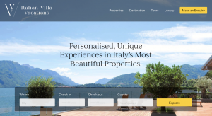
Robe Lifestyle (RL)
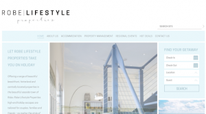
It might be helpful for you to bring up both these websites and try to assess what may make one better than the other. I encourage you to spend 5 minutes on both.
Which one did you prefer?
Now, I presume it won’t come as any surprise, but the IVV came through as the winning design (from a beautiful design perspective). From our testing, IVV scored an NPS of over 70, which is the highest of any website we’ve tested. Can you work out what might have helped contribute to this high score?
Here are some areas I want to draw your attention to:
- Plenty of space
Notice the spacing on the page. You can see there’s heaps of space around the text and other elements on the page. Space helps create a clean website and makes the content easier to absorb.
Ii. Short digestible text
You can see there are typically no more than three lines of text in each section, and the text typically does not fill the whole page. Shorter chunks of text are easier to absorb and less daunting for the user.
Iii. Beautiful images.
Don’t underestimate the impact of high-quality photography. You have likely all been on websites where you’ve seen a certain image that you’ve already seen on multiple websites, and the images look like they are from the US (or out of context for the market). If you can invest in original, applicable, and high quality images, it really helps differentiate your site from others.
Iv. Use of icons and illustrations
They say a picture paints a thousand words and it really is true. By strategically using relevant icons or illustrations, you make information digestion much easier for your user and the result is a more effortless and enjoyable experience. Try not to use overly ‘stocky’ icons though. The more these can be designed and in line with the true meaning of the information it is representing, the better.
v. Clear Call to Action Buttons
On the IVV, notice the big yellow and blue CTA buttons. They clearly draw attention and easily guide the user as to what they should do next. You don’t want to go overboard though. One, or a maximum of two, buttons above the fold is all you need. Any more, and you start to confuse the user as to the most obvious next step.
- Magic Bullet & Design Principle #2: Intuitive Design
Again, this point probably seems plainly obvious...but are you doing it? First of all, what does intuitive design mean? It basically means that users can clearly understand your design and that what they see when they click something is exactly what they expected. It also means you are pre-thinking about the effort they need to take, and designing elements that reduce their cognitive load and effort.
Let’s look a bit more about what this means.
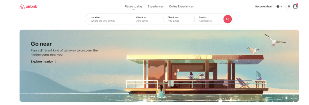
A great example of intuitive design is the Airbnb website. First of all, the designers seem to know exactly what you will want to do next and make that super obvious—that is to search and find a property in a location you wish to stay in. They make the search box front and centre of the home page. There’s no missing it.
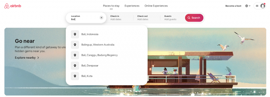
However, notice what they do next. It is subtle but really cool when you think about it (or experience it as a user). Let’s say I wanted to go to Bali for a holiday (and I do...particularly right now whilst stuck in lockdown!). You can see below that they predict some common places I may want to stay. That means I can easily click on the result and save myself from typing more information.
Then when I click into the Check in field, it brings up a nice large calendar showing two full months. When I select a date it also automatically shifts to the Check out step. Also notice that the Check out step is highlighted, helping to orientate me to where I’m at in the process.
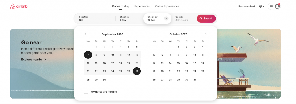
Finally, when I click on the Guests tab, it provides a drop-down for me to select numbers, broken out conveniently by Adults, Children & Infants. What this means is I can easily select the information with a simple click, rather than having to type anything in, saving me time.
Also notice that the search box is now included in the same box as Guests, giving me the strong visual clue that I’ve finished completing all the information and can hit the Search button.
The overall point I want to make here is that it’s important to think through all the steps your user will take and where they will have to expend effort. Any time a user needs to input information or make a click, this is effort, so you want to think through how you can reduce this effort.
In addition, make sure you test out what users think will happen next when they click on something. It’s essential that the click or action results in a reaction they were expecting. If not, this will create an error click or confusion. The more you can reduce error clicks or confusion, the better your design scores. These are just common sense tests, but don’t cut this part out. You’ll be amazed at how many times something you think is intuitive is actually misinterpreted by the user and needs to be rethought in a way to make it clear.
- Magic Bullet & Design Principle #3: Speed
Speed is a really interesting one as it might not be what you expect. The first thing to say is, speed matters. Research studies have shown that faster websites were consistently converting at more than 5-20% better than slower ones. In spite of this, what we found from our own research was that there was a variable even more important than load time. Interestingly, when this variable was better it resulted in better results even when it was actually slower. This was ‘perceived speed’. What is perceived speed? Well, perceived speed is simply how fast or slow a user thought the experience was. When a user feels an experience is fast, it doesn’t actually matter if it was a bit slower.
The best example of this phenomenon we encountered was with one of the big 4 banking apps. At the time of testing, they had the leading banking app in Australia (according to a mixture of quantitative metrics including NPS and SUS). Interestingly, it was rated as the ‘fastest’ app, but actually it wasn’t. It was quite a bit slower than some of its competitors, however the ‘perceived speed’ was faster. The reason for this was that they had some really clever loading icons and the intuitiveness of the design meant users were actually very forgiving of the slower speed (if in fact they realised it was slower). So there are three significant implications from this:
- Definitely pay attention to the load speed of your website and optimise as much as you can. You want to make sure your page load times are less than 3 seconds. This should keep you clear of any major reduction in conversion rates.
- Make sure you show you are loading elements on the page. If on a website, you can look at Lazy Loading to not frustrate your users so much if it is a bit on the slow side. Also consider loading elements and what visual feedback you can give users to let them know something is happening and that it is progressing.
- Again, focus on intuitive design, as our research shows that when you make users input less text or eradicate error clicks, they actually just perceive the website is faster than it is.
Now ‘speed’ may sound like a cop out as a web design principle, as it seems like it has nothing to do with design, however the reason I want to make such a big point of it is that it is a much bigger contributing factor than any other design aspect outside of the top two mentioned. For that reason, you should again focus extra attention on intuitive design as this will play a huge role in perceived speed.
Now this was the first of a five part series we are putting together about best practice website design principles that will ensure any design you put together is best in class. This first article lays the foundational blocks for what you need for a great website. The best secrets, (which we’ve learned through user testing for top Australian companies), are still to come. To find out what they are, feel free to sign up to our newsletter below or connect with me on LinkedIn. Even better, if you liked this article, send me a message.I’m super passionate about website design and would love to hear from you.